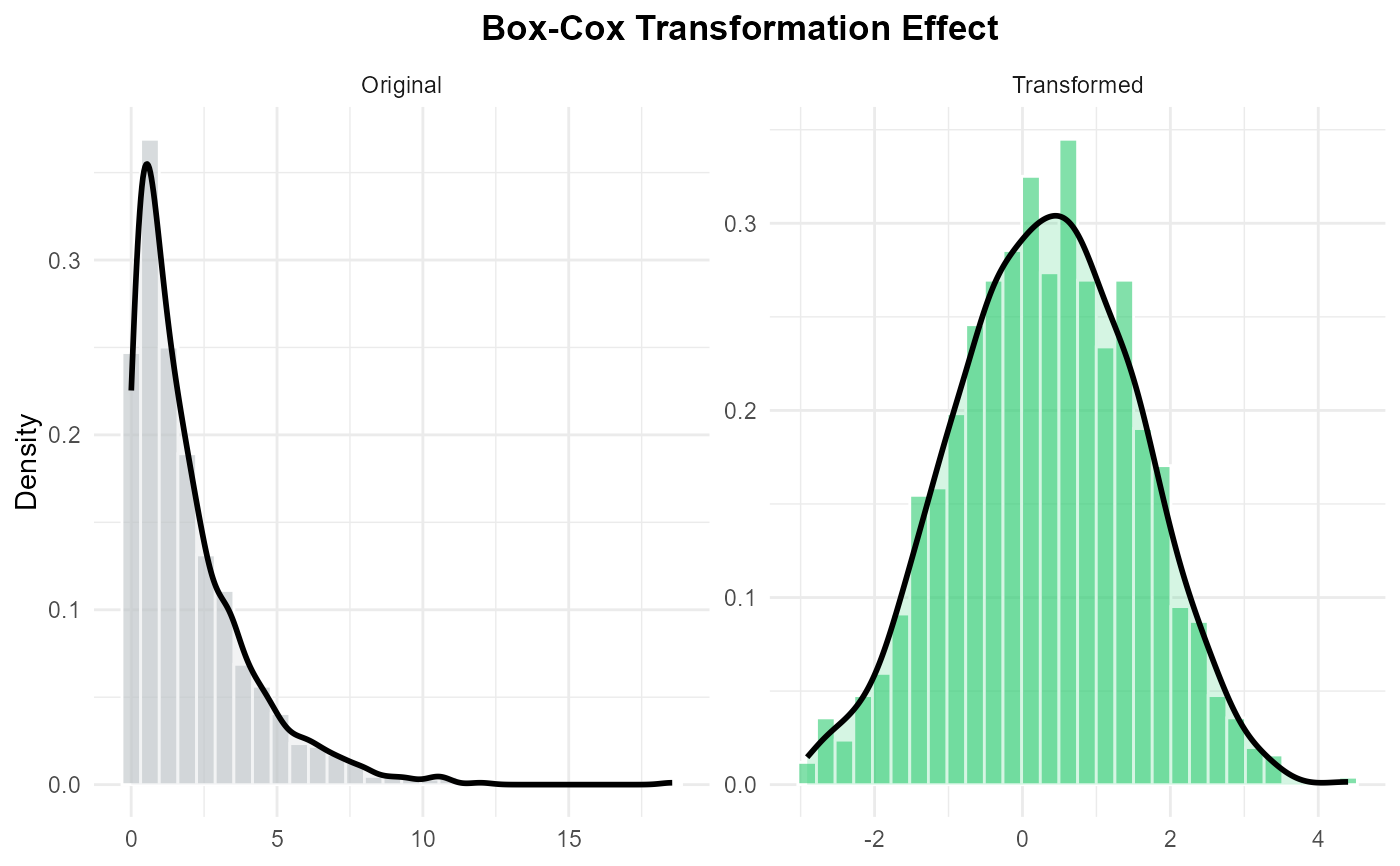
Creates a comparison plot to visualize the effect of a transformation. It displays histograms and density curves for both the original and transformed data.
Examples
# 1. Generate skewed data
x <- rchisq(1000, df = 2)

# 2. Transform it
y <- trans_boxcox(x)

# 3. Visualize
pp_plot(x, y, title = "Box-Cox Transformation Effect")